

This project, called “I give you a butterfly” is a collection of dinnerware designs and physical products that I made to sell and to be reproduced by retail companies. The collection consists of designs for six dinner plates, the designs of four mugs, a tote bag, and a series of long sleeve-shirts. I screen printed all of the articles of clothing and dinnerware designs myself using screen printing ink and a technique called monoprinting. The artwork I created to exist on these surfaces is symbolic, painterly, and natural.


The tote is an ombre of four colors, I designed the graphic to include a heart surrounded by birds, flowers, and calla lilies. It features the text “joy.”


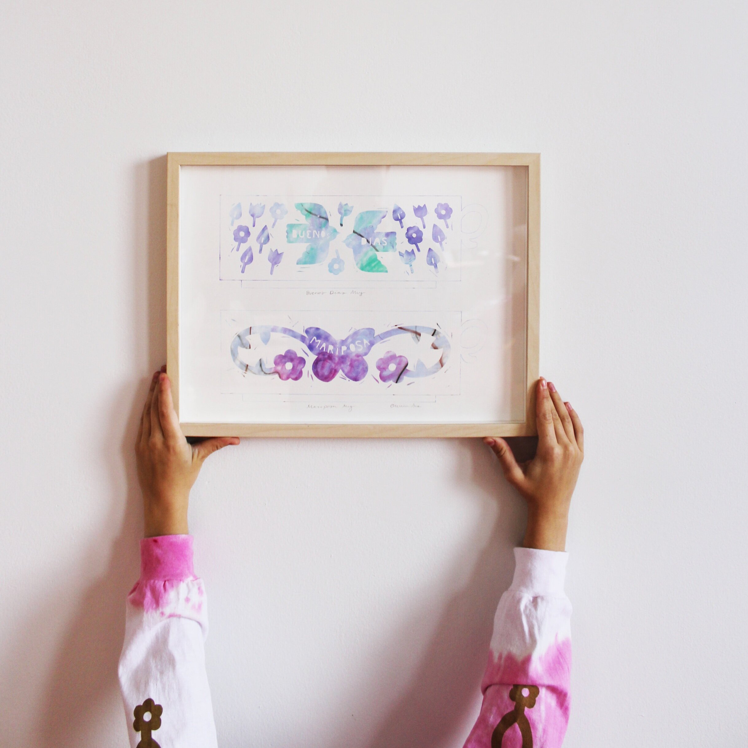
I dyed the shirts to be different colors within the collection and then screen printed on them. I wanted them to be very decorated, and have a design on each side. They have many butterflies on them and the text “sun, sky, moon.” Which is a very short poem I wrote when I was sixteen, it's basically just an acknowledgement of those entities and their beauty.

Instead of making physical dinnerware objects, I just designed the art for them, so that the art could be printed onto ceramics.

Chestnuts and Acorns

Under a Rock

Vines and Bird
The overall themes I worked with throughout “I give you a butterfly” were: home, nature, and balance. The theme of the home was explored more broadly, as not only a place where one lives or is from but also as people most close to me and as the natural world in which I reside. The theme of nature was expressed heavily in the designs I made. Animals, flowers, leaves, and nuts decorate every single design. Lastly, the more abstract theme of balance was focused on theoretically. Through my color choices, I depicted a time of seasonal transition between summer and fall. I used bright blues, pinks, and purples alongside cool and warm browns and olive green.

La Gata y sus Gatitos

Floridian Homes

Talisman
Let's start with the side plate called Floridian homes. The day I drew this plate I was reminiscing about walking through the streets of my Tia Eddy’s neighborhood in Florida. All the homes in the neighborhood have red tile roofs, a bougainvillea plant creeping up a gate or a wall, and plenty of palm trees. I remember walking through this neighborhood at different times of my life, with my family or my cousins. In this design I layered several colors of crayon to achieve off white Spanish style houses coupled with friendly palm trees and a small scenery of a person walking their dog.
The next piece is called Chestnuts and Acorns. Most of my designs are based on nature that I see around me. When I walk outside, even in Portland, I pay attention to all the forms, species, and stages of the plants around me. I'm drawn to, even obsessed with abundance. A tree that is full of chestnuts or acorns draws me in with curiosity. For that reason I wanted to create a plate that is an assemblage of different leaves, nuts and bugs. In this design I separated each element with a different color, but stuck to an earthy brown and green palette.
In the piece La Gata y sus Gatitos I detail two memories combined. The memories I combined are of Casita Typicas- which are a mini figurine houses that are hung on the wall- and a time I fed baby cats cheese balls. The illustration depicts a mama cat and her four babies looking out over the top of a house protectively. The house is modeled after a Casita Typica, with a terracotta roof and decorative pillars. The symbolism of this piece goes deeper: there are five people in my immediate family, so five cats represent them. The spheres of the earth are also featured: birds are the sky, cats are the land, and fish are the sea.


The piece Vines and Bird is more restrained, I designed it more with decoration in mind than story. In this piece the bird represents freedom as it belongs to the sky and air, it is unbound by gravity and can take to the sky and explore the vastness of empty space. I used a mix of blue and green to create magical vines, twisting and intertwining in a ring. There is much to be said about how the ring of vines represents the cyclical nature of life, they even look like DNA.
The side plate called Under a rock is about the buzzing intensity of the forest floor. Over the summer I looked closely at the ground underneath a plum tree and found that it was not at all quiet or calm, but bustling with spiders, slugs, ants, and caterpillars. This moment made me reflect on how nothing in this world really is still, there is always movement and life. The butterfly in the middle is a metaphor for the cycle of life and transformation, as caterpillars go through chrysalis to become butterflies.
The design for the Talisman side plate is based off the design imprinted into a sando strawberry cookie. With a ring inside another ring, it makes me think about circular calendars, like those which you can rotate and change the image that appears with every season. The way that the circles interlock feels very grounding to me, so I called it talisman. Talisman are objects that are lucky, like a four-leaf clover or yellow underwear. I am very interested in the idea of making my own talisman through art and iconography.


Monoprinting is different from screenprinting in that there is more room for happy accidents, experiments, and play in the process, whereas normal screen printing is more about production because you already have separated the layers you want in different colors and are hand printing the designs you already made. When I was making monoprints I experimented with how much water I should add to the screen and how I should apply the crayon: should I use a brush or a crayon directly?